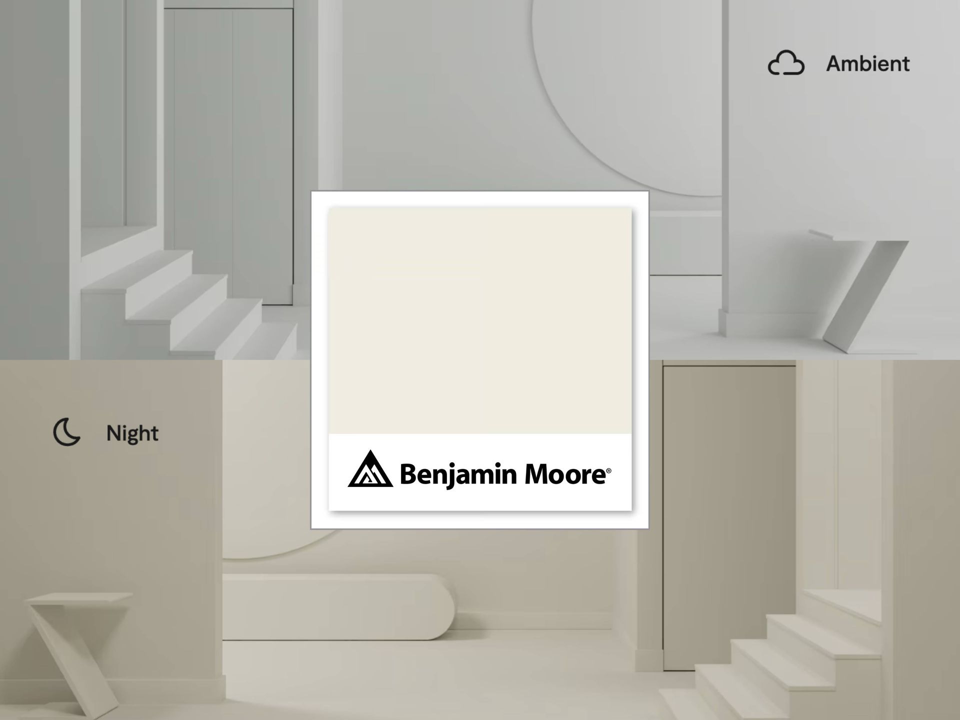
Introducing Benjamin Moore’s 2026 Color of the Year
At Color Store, we are always keeping an eye on the latest color trends. Each year, Benjamin Moore makes a splash in the interior décor space by announcing their choice for Color of the Year. This color is an early taste of what design trends are on their way for 2026.
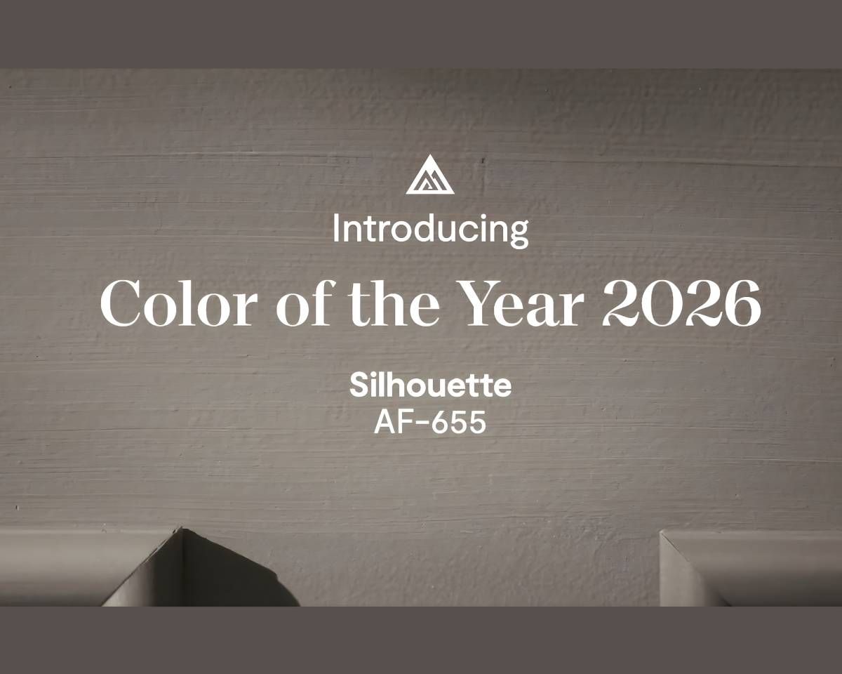
Earlier this month, Benjamin Moore announced Silhouette AF-655 as 2026 Color of the Year. This earthy and rich shade of gray is versatile enough to pair with an array of interior décor styles, but is unique and bold enough to make a statement.
Earthy elegance is in, and today we are sharing a few of our favorite ways to make the most of this newly unveiled color palette and how our team can help.
The Benjamin Moore Color of the Year 2026, Silhouette AF-655
Benjamin Moore Silhouette AF-655 is a shade that effortlessly bridges contrast. It’s moody without being dark, grounded without feeling heavy, and sophisticated while still being livable. Its subtle warmth complements organic textures, while its depth helps lighter elements stand out, perfect for homeowners and designers looking to add subtle drama to their dining room or bedroom. Its subtle undertones make it the perfect choice for accent walls, cabinetry, or even trim details, especially when paired with lighter hues.
Using Benjamin Moore Color Trends 2026 Palette in Your Home
With the debut, Benjamin Moore also revealed the Color Trends 2026 Palette—eight thoughtfully chosen soft neutrals and cool mid-range shades that expand your interior paint possibilities. These colors are intentional and inspiring.
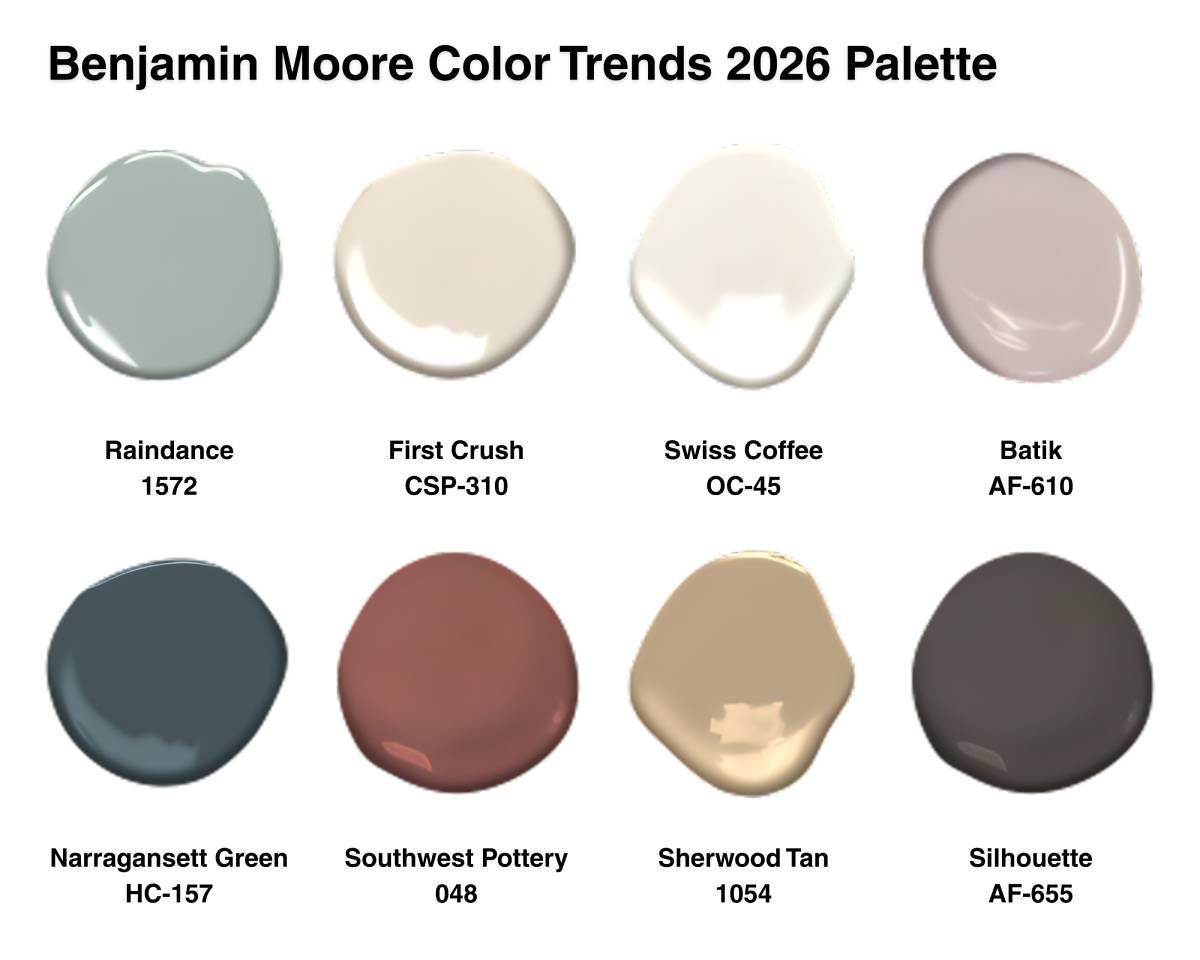
- Raindance 1572: A serene, pale blue-green with a gentle gray undertone. Easygoing and timeless, it transitions seamlessly between rustic, coastal, or traditional interiors. Pair with: Swiss Coffee or light oak finishes.
- First Crush CSP-310: A delicate blush tone that feels fresh and uplifting. This subtle pink brings warmth and lightness to bedrooms, baths, or entryways—spaces where serenity matters most. Pair with: Creamy whites or polished brass accents.
- Swiss Coffee OC-45: The perennial favorite of designers everywhere. This creamy white balances warmth and sophistication, ideal for highlighting millwork, ceilings, or trim. Pair with: Any hue from the palette—it’s the ultimate versatile neutral.
- Batik AF-610: A graceful blend of violet and rose with a hint of gray. Ethereal and sophisticated, Batik shifts subtly with lighting, lending depth to a minimalist or tailored setting. Pair with: Narragansett Green for a rich, unexpected contrast.
- Narragansett Green HC-157: A powerful blackened teal rooted in Benjamin Moore’s Historical Collection. Stately yet fresh, it works well with soft tones like Batik or Swiss Coffee. Pair with: Warm wood textures or creamy neutrals.
- Southwest Pottery 048: A warm brown-red reminiscent of desert earth. This adaptable shade visual warmth, perfect for accent walls or dining spaces. Pair with: Yellows, organges, blues, and raw, natural wood.
- Sherwood Tan 1054: A classic, earthy tan that functions as a grounding neutral. It creates a beautiful backdrop. Pair with: Swiss Coffee, Southwest Pottery, or Silhouette for layered depth.
- Silhouette AF-655: The centerpiece of the collection—a deep, dramatic charcoal-brown with sophisticated versatility. Ideal for creating cozy corners, moody dining rooms, or luxurious cabinetry. Pair with: Swiss Coffee for high contrast.
How To Use Silhouette (Paint Color)?
1. Elevate Living and Dining Spaces
Silhouette’s rich undertones make it an excellent choice for dining rooms, living rooms, and gathering areas. Use it as an accent wall to create intimacy and warmth, pairing it with Swiss Coffee OC-45 or Raindance 1572 for a soft, tonal balance. Metallic accents, like brushed gold or bronze, elevate sophistication.
2. Bring Depth to Kitchens and Bedrooms
In spaces with wood fixtures, like kitchens and bathrooms, we love how Silhouette pairs wit natural wood and painted whites. In bedrooms, Silhouette makes white mouldings and wainscotting pop. Try pairing it with Sherwood Tan 1054 for a grounded, organic combination.
3. Accent Architectural Details
If you prefer subtlety, use Silhouette on trim, doors, or built-ins. Its rich tone helps highlight craftsmanship and brings contrast to lighter wall colors. The effect feels layered and interesting, and we think it’s perfect for transitional interiors.
Adding Benjamin Moore’s 2026 Color of the Year to Your Des Moines Home
If you’re looking for some inspiration on how to use the latest color trends, we’re here to help. Ready to refresh your space? At Color Store, have 3 locations in Des Moines & Waukee IA and Omaha NE for all things related to premium interior and exterior paint.
Schedule a free color consultation today or stop by our showroom and discover Benjamin Moore’s 2026 Color of the Year and much more!
We are proud to always be locally owned and operated, happy to service Des Moines and Waukee, Iowa, Omaha, Nebraska, and the surrounding areas.